Personal Care Prodcts Council

A full website redesign for a 600-member trade association, reorganizing years of patchwork content into a coherent information architecture that made previously buried key pages accessible within one to two clicks.

Accessibility Audit
Content Strategy
Information Architecture
User Acceptance Testing
image of studio setting (for a game development company)

Background

The Personal Care Products Council (PCPC) is a trade association representing over 600 member companies in the cosmetics and personal care industry — an organization whose work touches product safety regulation, sustainability standards, and consumer advocacy.

Challenge

Their website didn't reflect any of that weight. Years of patchwork content additions had left the site's information architecture incoherent: pages that should have been easy to find required five or more clicks, content types overlapped and duplicated each other, and the navigation had drifted so far from user intent that internal staff struggled to locate their own organization's materials.

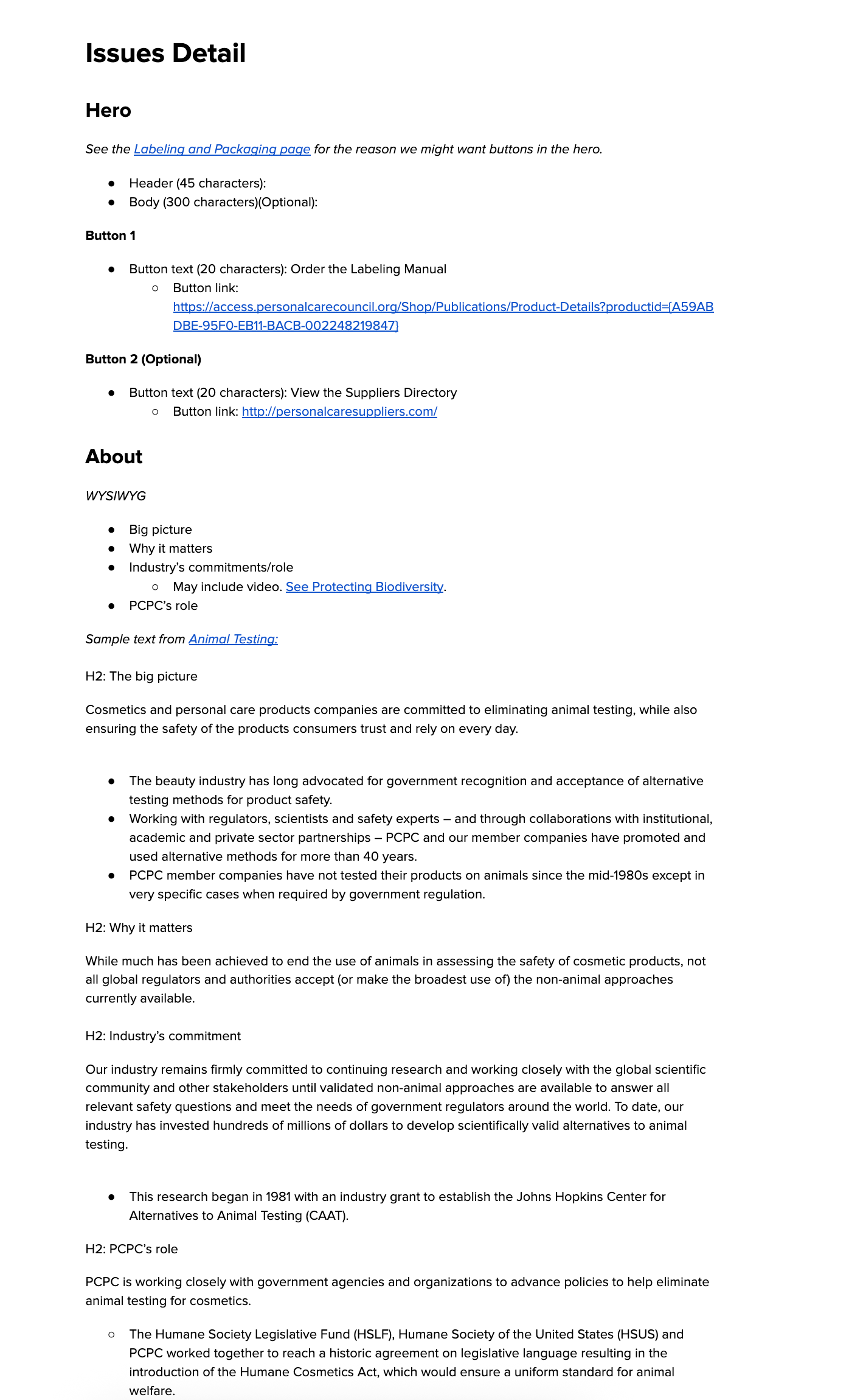
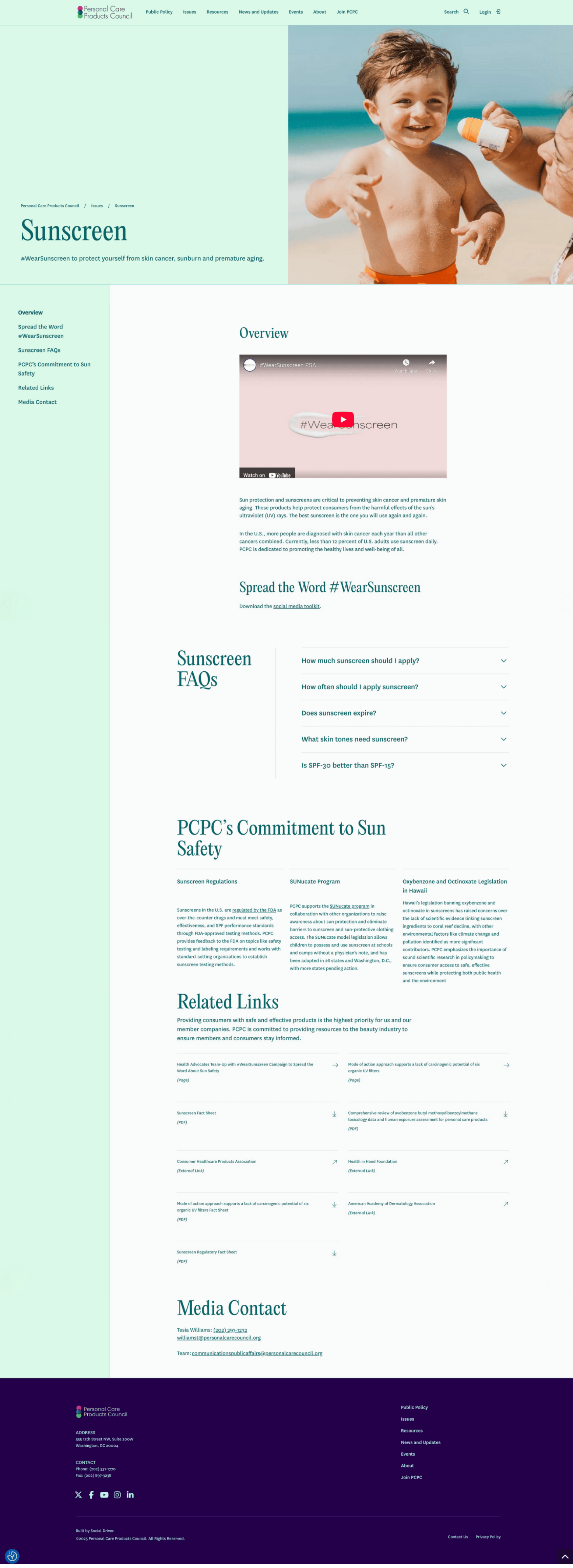
The issues pages — arguably the most strategically important section of a trade association's website — had collapsed into dense, unbroken text. There were no clear calls to action, no content relationships between related topics, and no visual hierarchy to help readers understand what PCPC's position actually was on the issues they cared about. The site communicated volume, not authority.

The underlying CMS structure was equally limiting: the events content type lacked the flexibility their team needed, and there was no scalable system for connecting events to related issue areas, publications, or member resources.
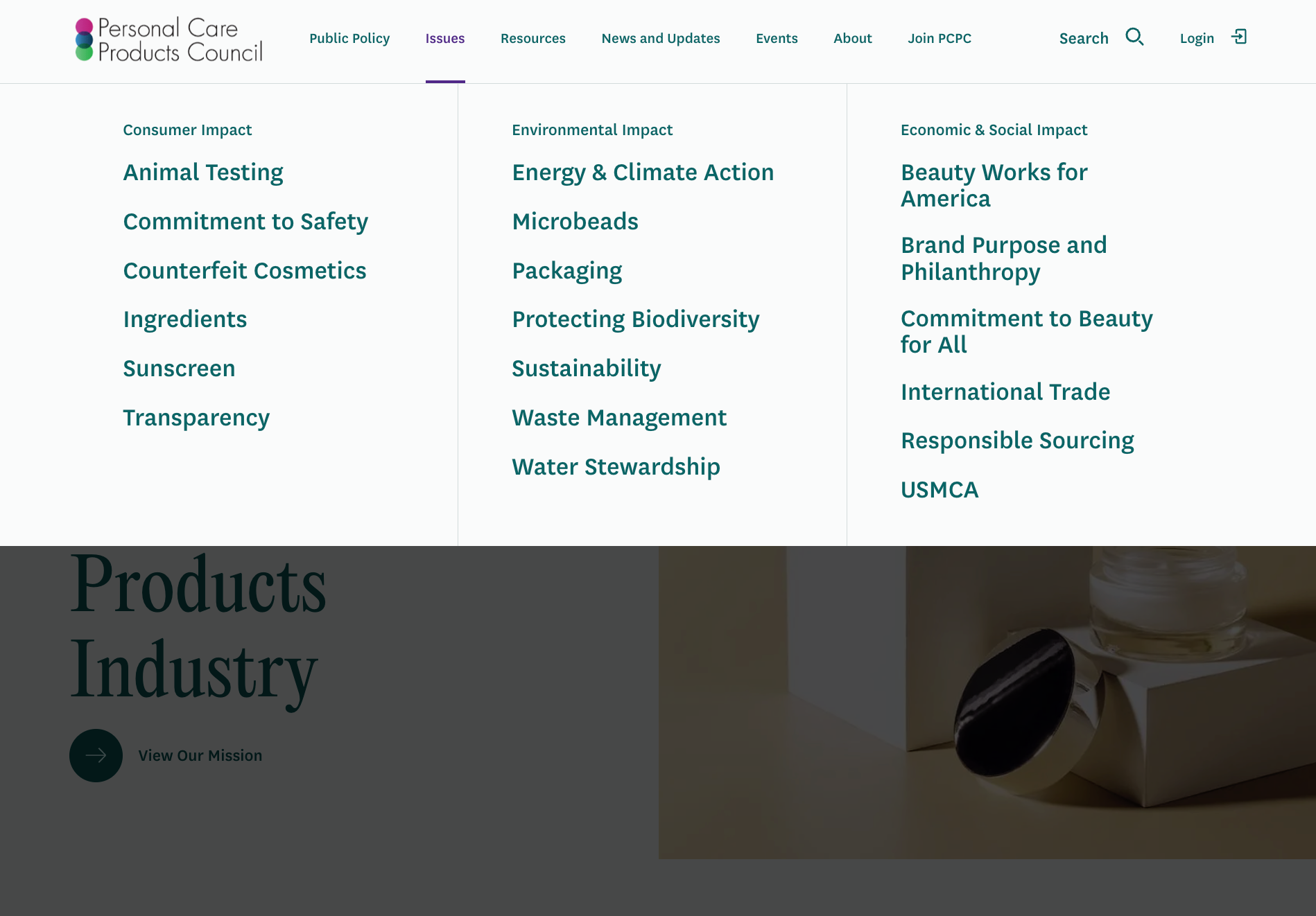
[interface] screenshot of collaboration interface (for a productivity tools business)
PCPC's original main navigation, containing only a few of their issue areas
image of manufacturing plant interior
Proposed updated main navigation, surfacing priority issue areas

Solution

I began with a full site audit using ScreamingFrog to map the existing architecture, then layered in a content analysis to identify overlap, redundancy, and orphaned pages. What emerged was a clear picture of where the site's structure had diverged from how users actually think about PCPC's work.

Rather than presenting the client with a traditional sitemap, I proposed the redesigned navigation as a set of dropdown mockups — visually showing how the reorganized content would actually look to a user. This made the strategic rationale tangible and significantly reduced back-and-forth during stakeholder reviews, because the client could react to something concrete rather than an abstract hierarchy.

Key decisions and deliverables:

  • Restructured information architecture that surfaced the content users were actually looking for, organized around audience need rather than internal department ownership. Consolidated overlapping news content types into a unified publishing structure — simpler for the editorial team to maintain, and easier for users to navigate.
  • Issues page redesign with sticky in-page navigation, related content feeds, and a flexible component library (stats, cards, stylized lists, pull quotes) that gave the content team tools to write for the web rather than for print. Every page was mapped to a clear call to action so users had a next step rather than a dead end.
  • Content outlines for all key pages, developed in close collaboration with PCPC's communications team to align the new architecture with their editorial workflows and ensure they could maintain the site confidently post-launch.
  • Events content type overhaul, developed in close partnership with the development team. Rather than building a one-off solution, I advocated for scoping the work as a reusable base-theme component — one that addressed PCPC's specific needs while building in flexibility for other clients requesting similar functionality. The resulting content type included richer metadata fields and relationship hooks to connect events with issue areas, publications, and team members.

Showcasing my journey

Early content outlines and wireframes consolidated similar content into clear sections

Homepage content outline
Issues detail page content outline
Homepage wireframe
Issues detail wireframe

Result

The redesigned site dramatically reduced the depth required to reach key content. Pages that previously required five or more clicks from the homepage became accessible from the main navigation or within one to two clicks — a structural improvement that matters most for the member companies and policy audiences PCPC needs to serve efficiently.

PCPC's communications team gained a CMS they could actually use — a component-based page builder that encourages visual storytelling without requiring developer support for routine updates. The events content type improvement had a compounding benefit: it became part of the agency's base WordPress theme, directly serving subsequent clients who had been requesting similar functionality.

image of a teambuilding activity (for a consulting firm)
image of ai algorithm development process
[background image] image of blueprint (for a construction company)
image of contact details graphic (for a travel tech)